PERSONAL PROJECT
Meridian Antiques & Oddities
Meridian Antiques & Oddities is a London-based collector specialising in fine antiques, historical curiosities, and rare archival artifacts.
Founded in 1963, the brand has spent decades building a reputation for sourcing highly curated, eccentric, and premium items.
The goal of this project is to formalise a cohesive visual identity system for a comprehensive brand rollout.
This brief outlines the transition from a traditional heritage shop to a sophisticated, mysterious, and highly tactile lifestyle brand, balancing a heavy sense of physical history with deliberate, editorial layout design.
The Creative Challenges
Balancing Visual Clutter
Antique shops are inherently packed, dense, and chaotic. The visual language must embrace this curated chaos without letting the visual identity get lost in the noise.
Avoiding Stereotypes
The identity needs to feel historic and archival without looking dated, stale, or unapproachable to modern collectors, locals, or seasonal tourists.
Ensuring Digital Legibility
High-grain, moody, and low-exposure photography to cut through deep shadows and complex backgrounds without disrupting the atmospheric tone.
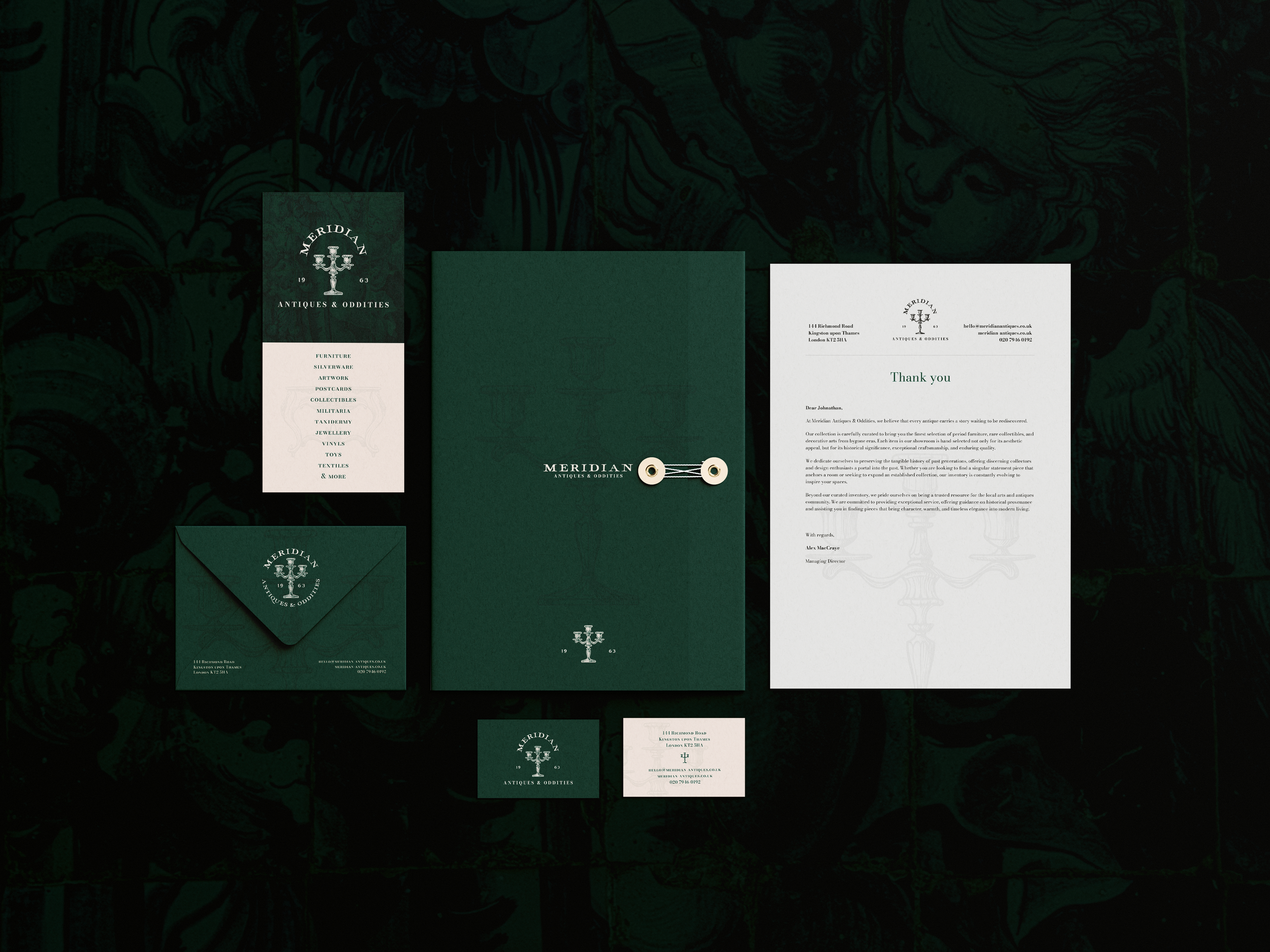
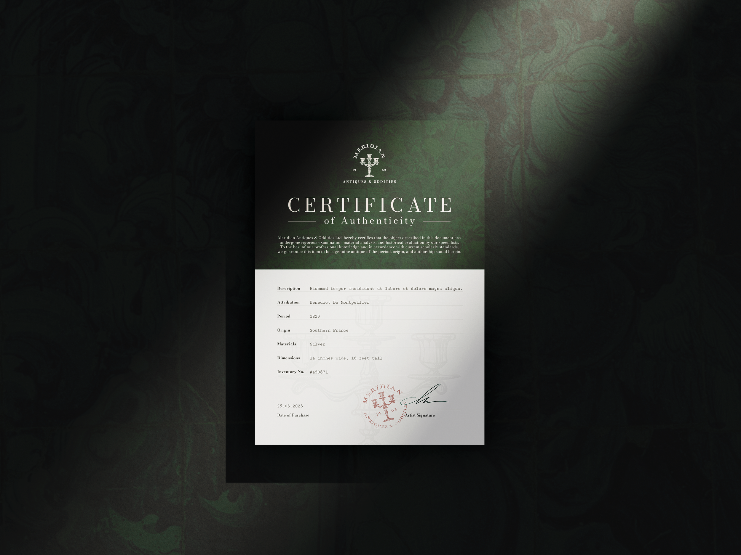
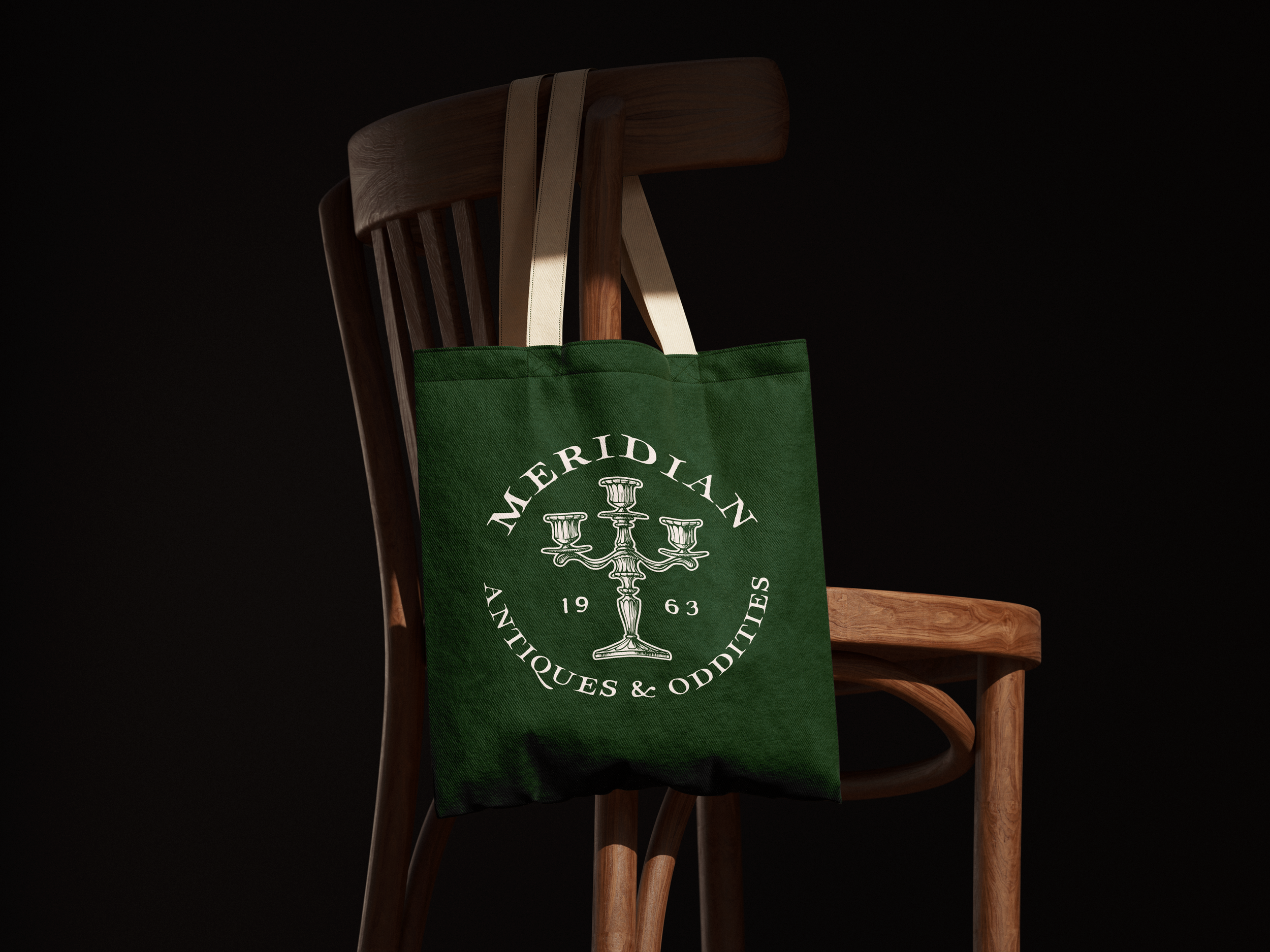
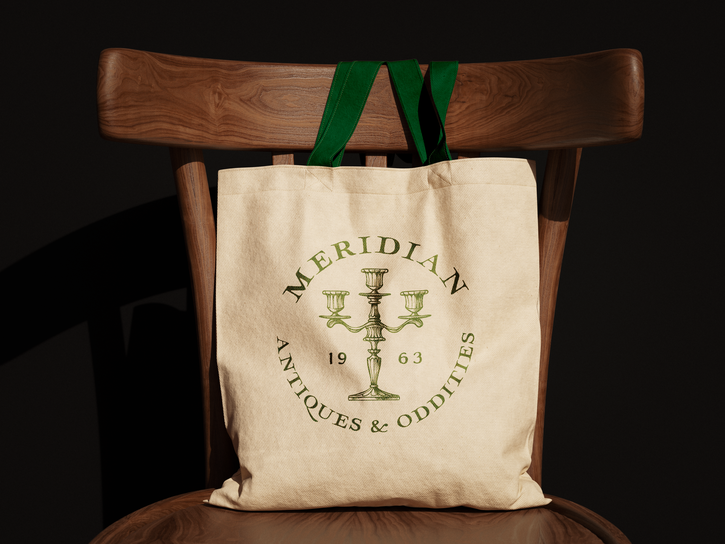
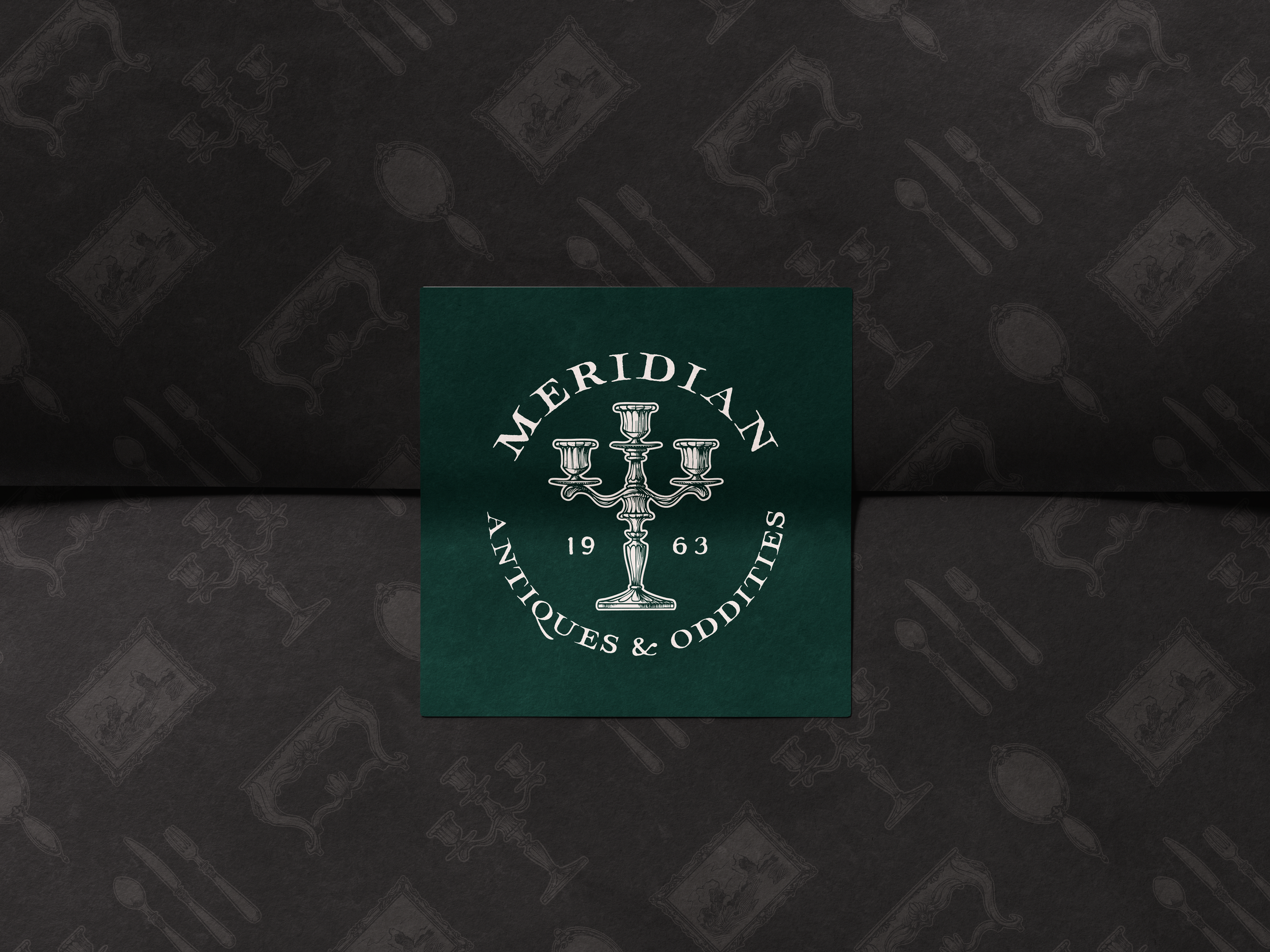
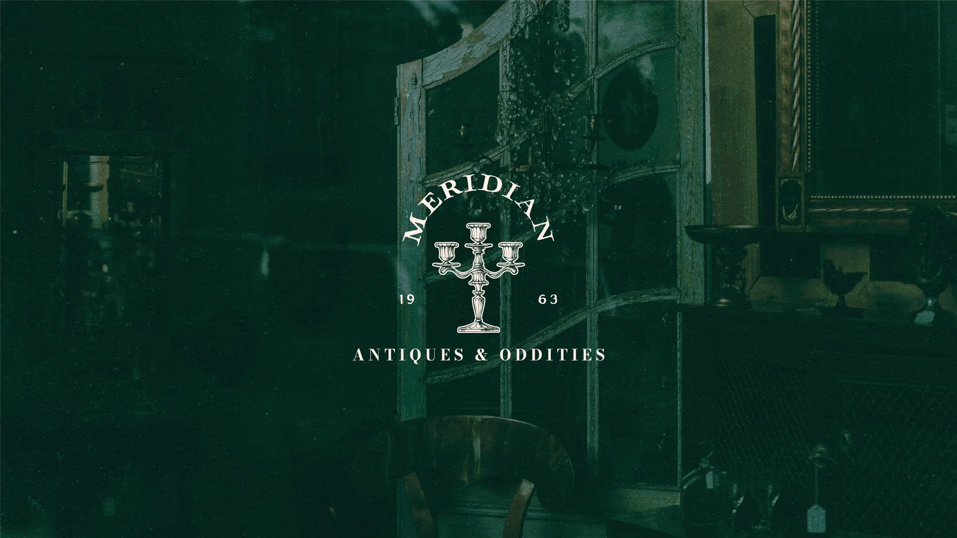
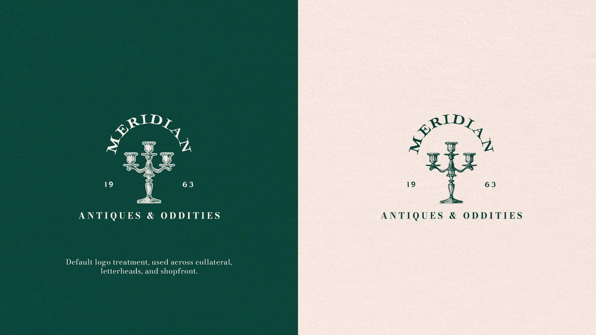
Logo Treatment
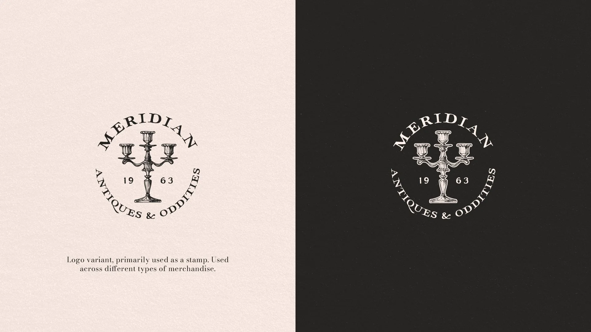
The first key element in building the logo was in the name itself, translating 'Meridian' into an arched wordmark.
The name ‘Meridian’ is meant to illustrate that all the products they supply and display can come from any corner around the globe.
The candleholder serves as the centrepiece of the logo, symbolising the longstanding and respected presence the shop has had since its inception in 1963 - another small element that is present across all branded materials.
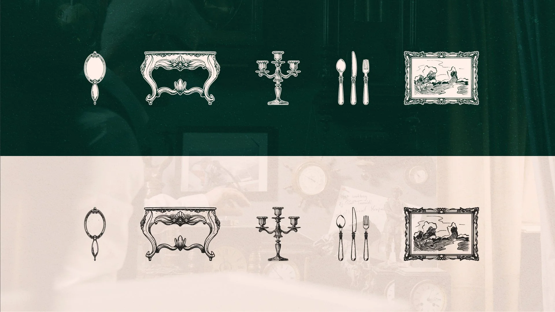
Iconography
Part of the brand identity involves unique, hand-drawn icons to be used across collateral and for their respective website sections.